Harmoni
App
Timeframe
3 weeks
Role
UX/UI Designer
Tools
Figma
Team
Myself and 1 Developer

The Problem
Clinics in New York City serve a large population of non-English speaking immigrants. During clinical visits, they rely on third-party translators, which:
Take time to assign and cause delays.
Charge high fees, making them inaccessible for financially struggling patients.
Who It Affected
Non-English speaking patients (primarily immigrants) seeking medical care.
Why It Mattered
Due to the high cost of translation services, many patients avoided seeking medical care altogether, putting their health at risk. This led to delayed diagnoses, poor communication, and unmet healthcare needs.
The Solution
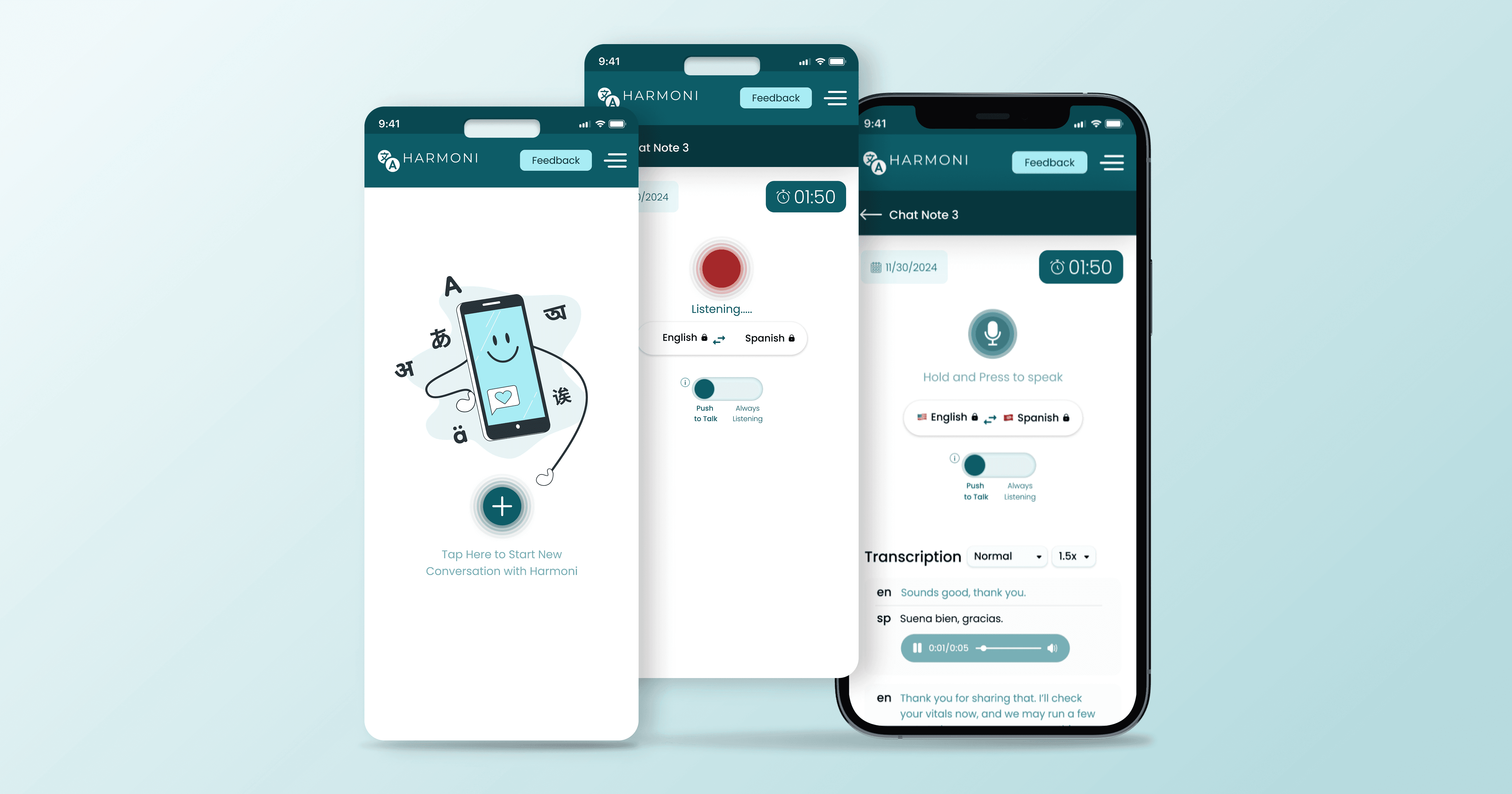
To eliminate the financial barrier and streamline communication, we built Harmoni AI Healthcare Translator—an in-house app offering affordable, real-time translation.
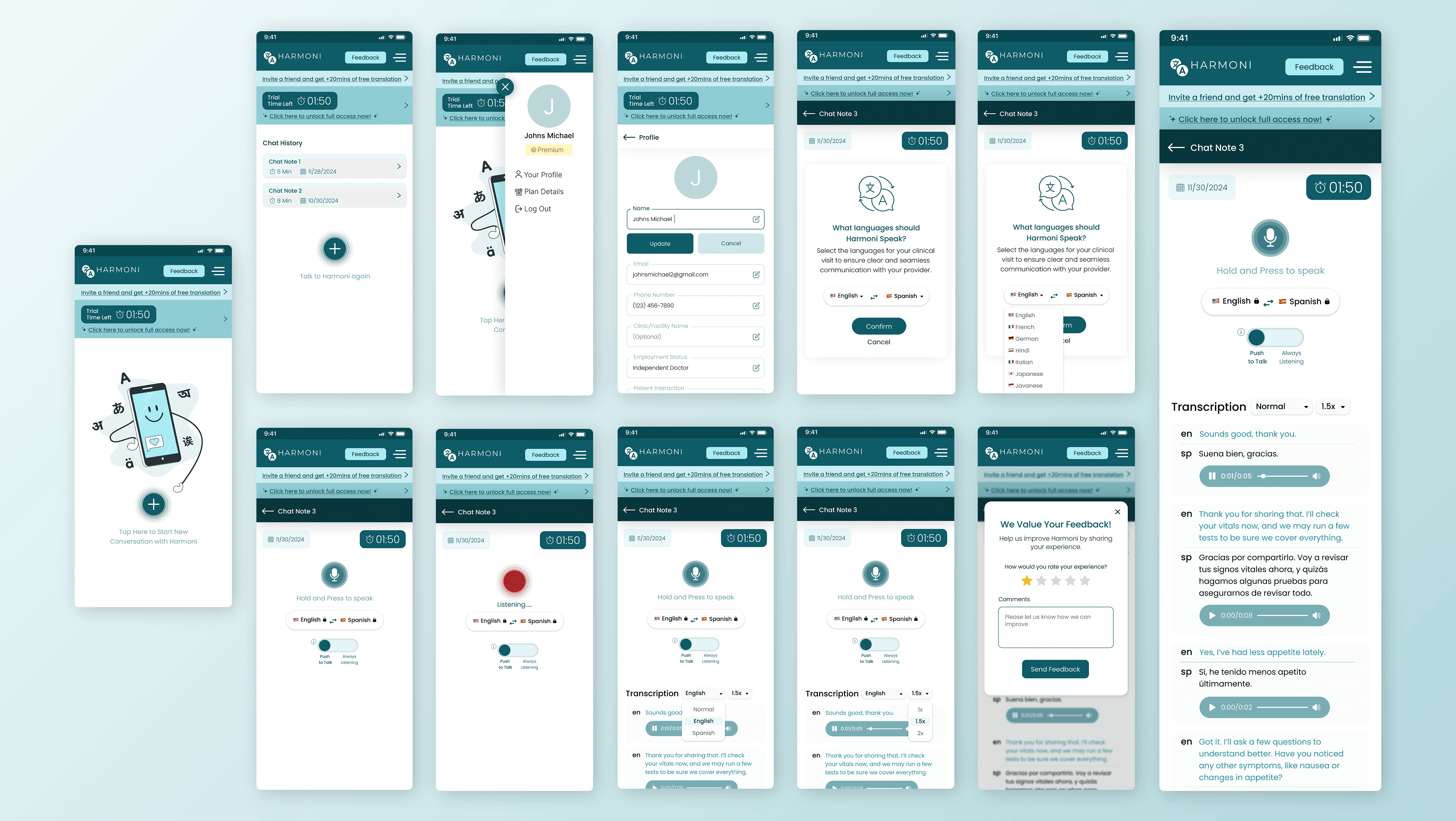
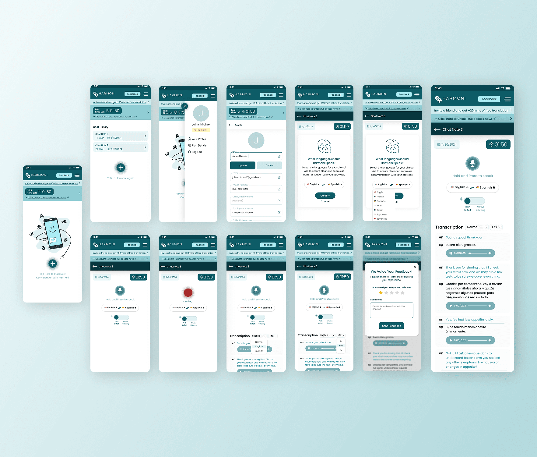
Key Features


My Design Process
Research & Insights
Collaborated with stakeholders to understand patient pain points.
Conducted secondary research on translation services in NYC.
Identified the need for affordable, accessible, and real-time translation.
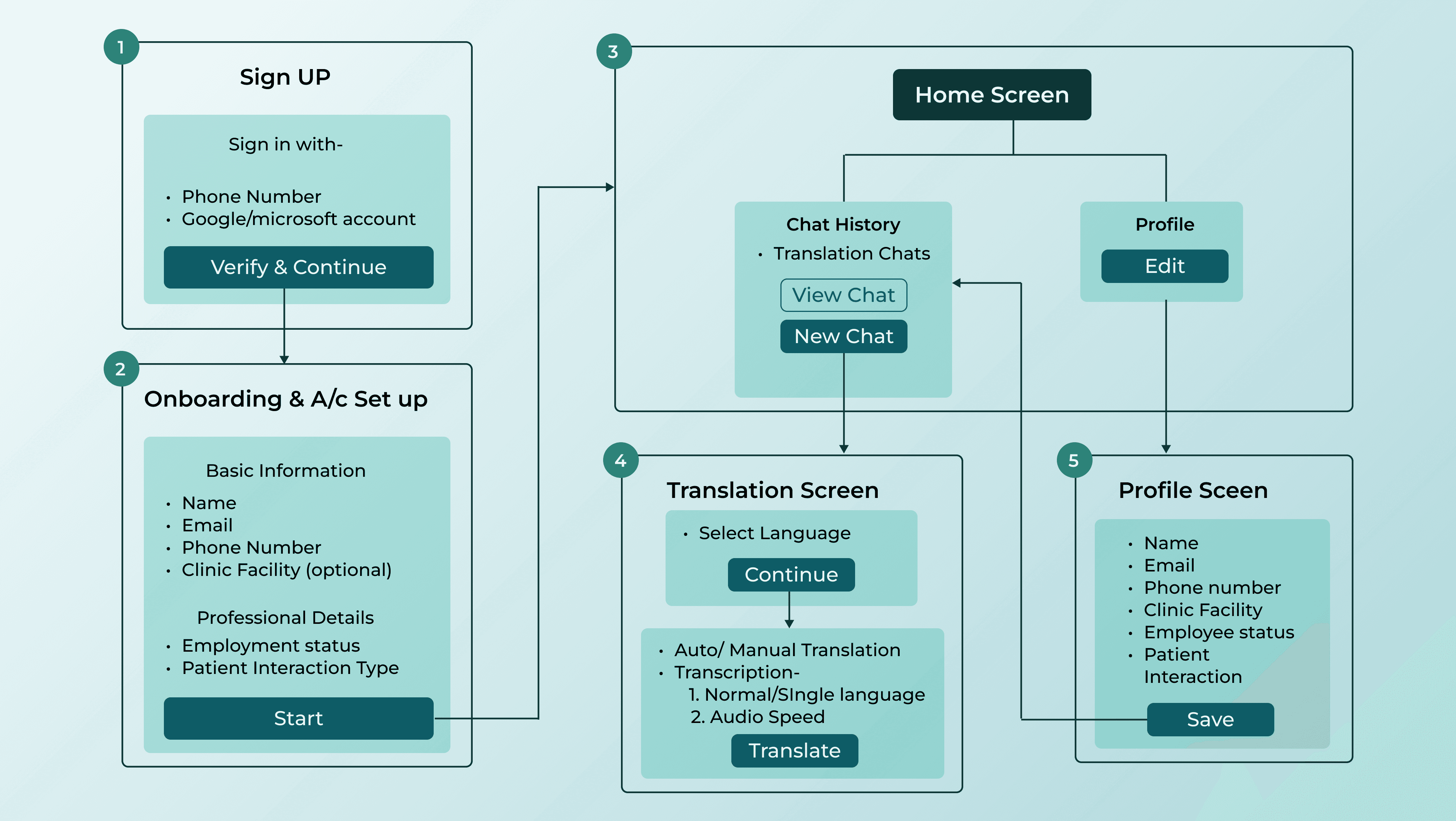
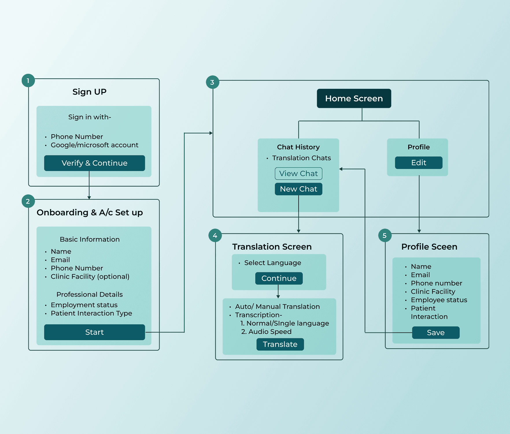
Ideation & User Flow
In the old UX flow, the app had only:
A single screen that directly launched the translation service.
Basic text and voice translation with limited functionality.
In the new UX flow, I introduced:
Home Screen: Displays chat history, allowing users to revisit past conversations.
Language Selector: Users can lock in their preferred languages before starting the session.
Real-Time Audio Translation:
Auto Mode: Continuous translation (no need to hold the button).
Manual Mode: Press-and-hold for translation on demand.
Dual-View Playback: Displays both languages (provider & patient) in text and audio format.
Playback Speed Control: Users can adjust speed for better comprehension.
Language Display Options: Users can choose between dual-language or single-language views.
Wireframing & Prototyping
Created low-fidelity wireframes to outline the new structure and flow.
Iterated with stakeholder feedback for improved user interaction.
Built a high-fidelity prototype to simulate the real-life experience.
Added micro-interactions during live translations for better UX awareness.
Usability Testing & Iterations
Designed the final high-fidelity UI with a clean, intuitive layout.
Ensured the prototype mirrored the live product experience.
Included animations to indicate when the translation feature was active, enhancing user awareness.
No iterations were required, as this version was the refined, optimized iteration of the previous app.