Patient Education App
Designed an interactive platform that educates and engages patients, leading to a 25K+ user adoption.
Nao Medical
Mobile App
Timeframe
2 months
Role
UX/UI Designer | Graphic Designer
Tools
Figma
Team
Senior UX/UI Designer & 2 Developers

The Problem
Patients lacked knowledge about the conditions they were being treated for. With limited transparency in care plans, they were unaware of symptoms, treatment details, and care gaps. This resulted in missed opportunities for early intervention and effective self-management.
Who It Affected
Women aged 18-40 were most affected. Prioritizing family, career, or academics often left their health neglected. Without clear insights, they remained unaware of potential health risks and the care plans laid out for them.
Why It Mattered
Educating patients meant empowering them to recognize symptoms early, take preventive actions, and make informed decisions. It also improved transparency, ensuring they understood their treatment plans and could advocate for their health needs.
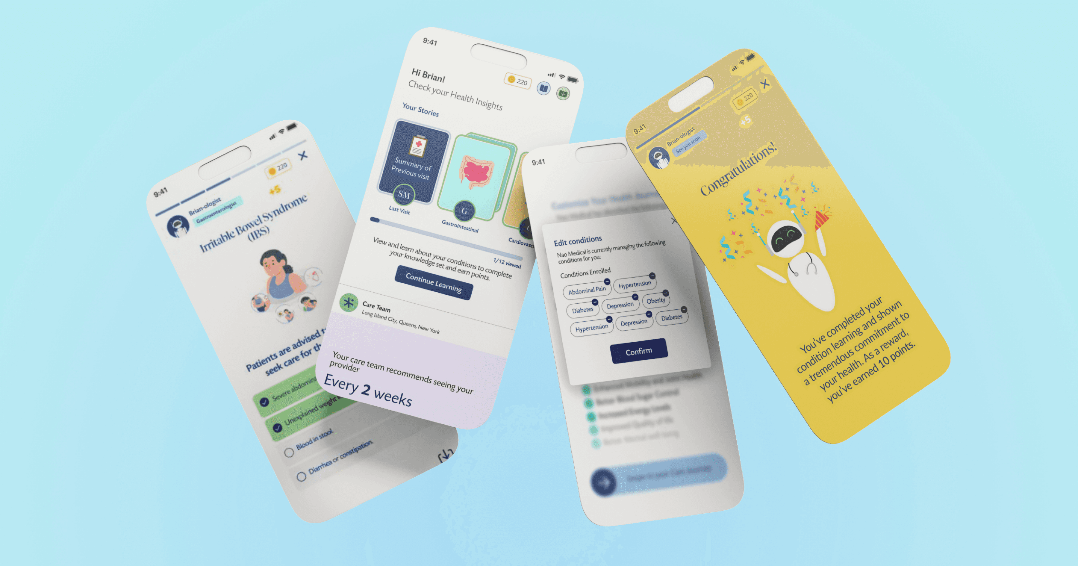
The Solution
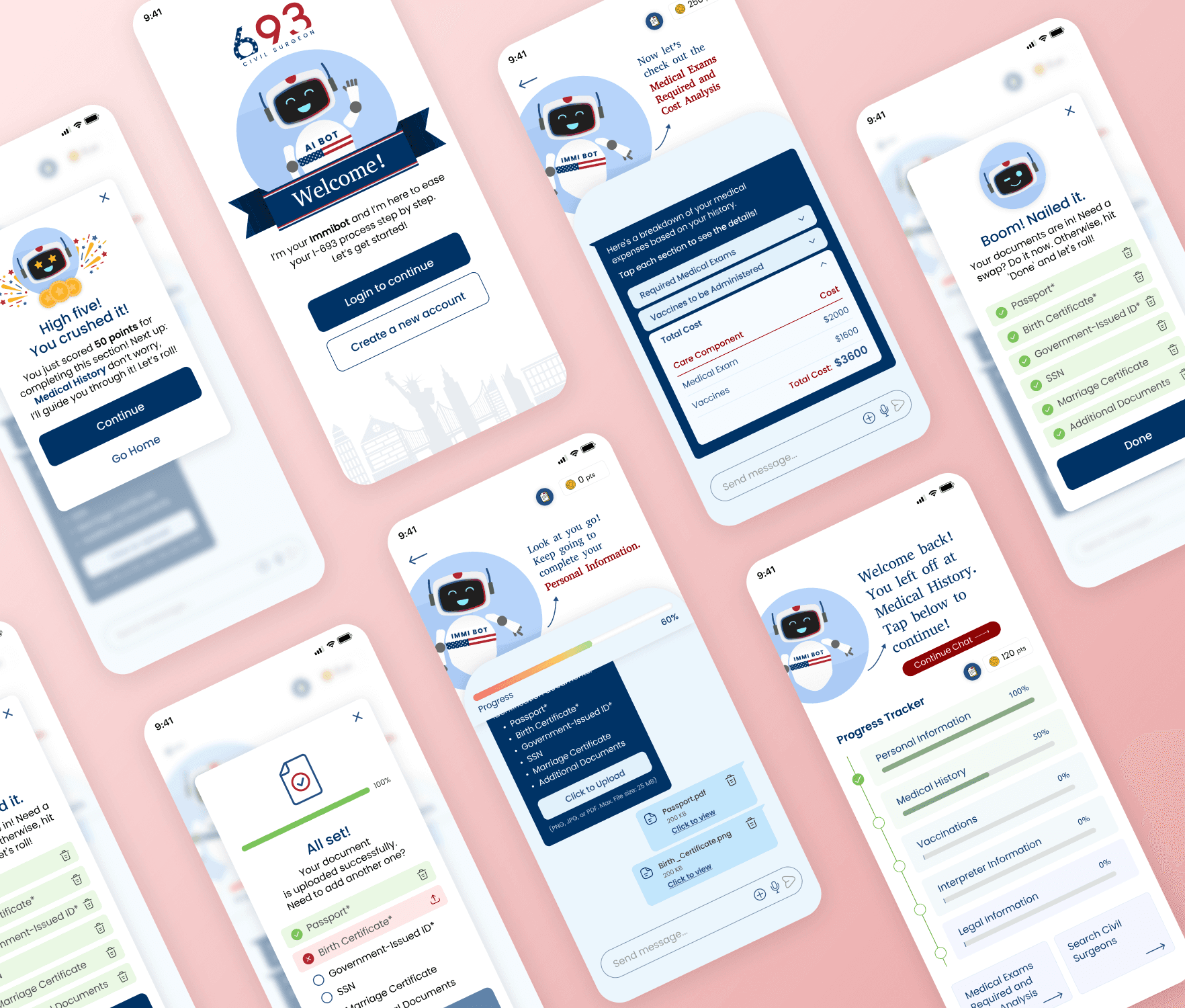
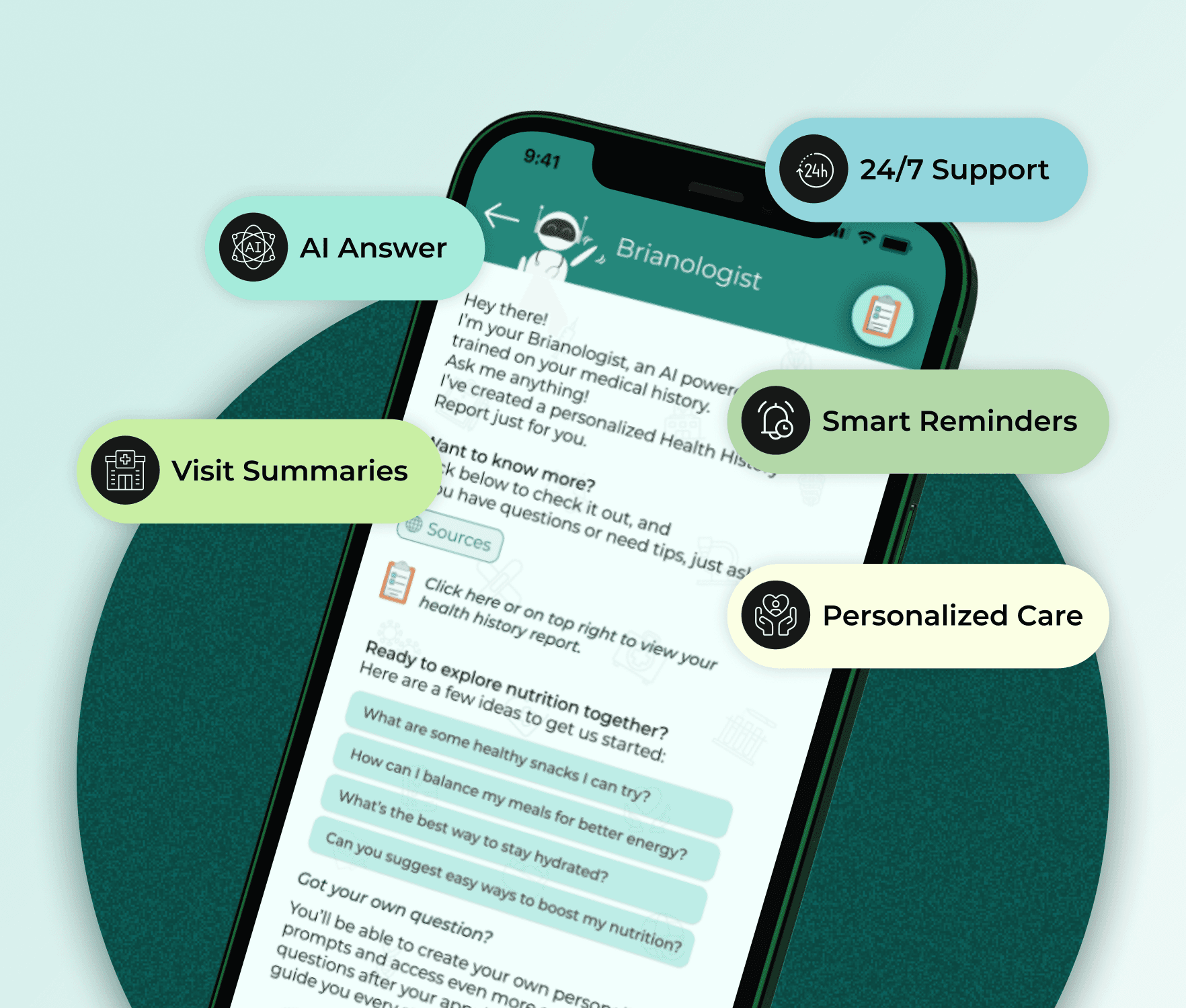
To address the transparency gap, I designed the Patient Education App—an interactive platform that empowers patients with knowledge about their conditions and care plans.
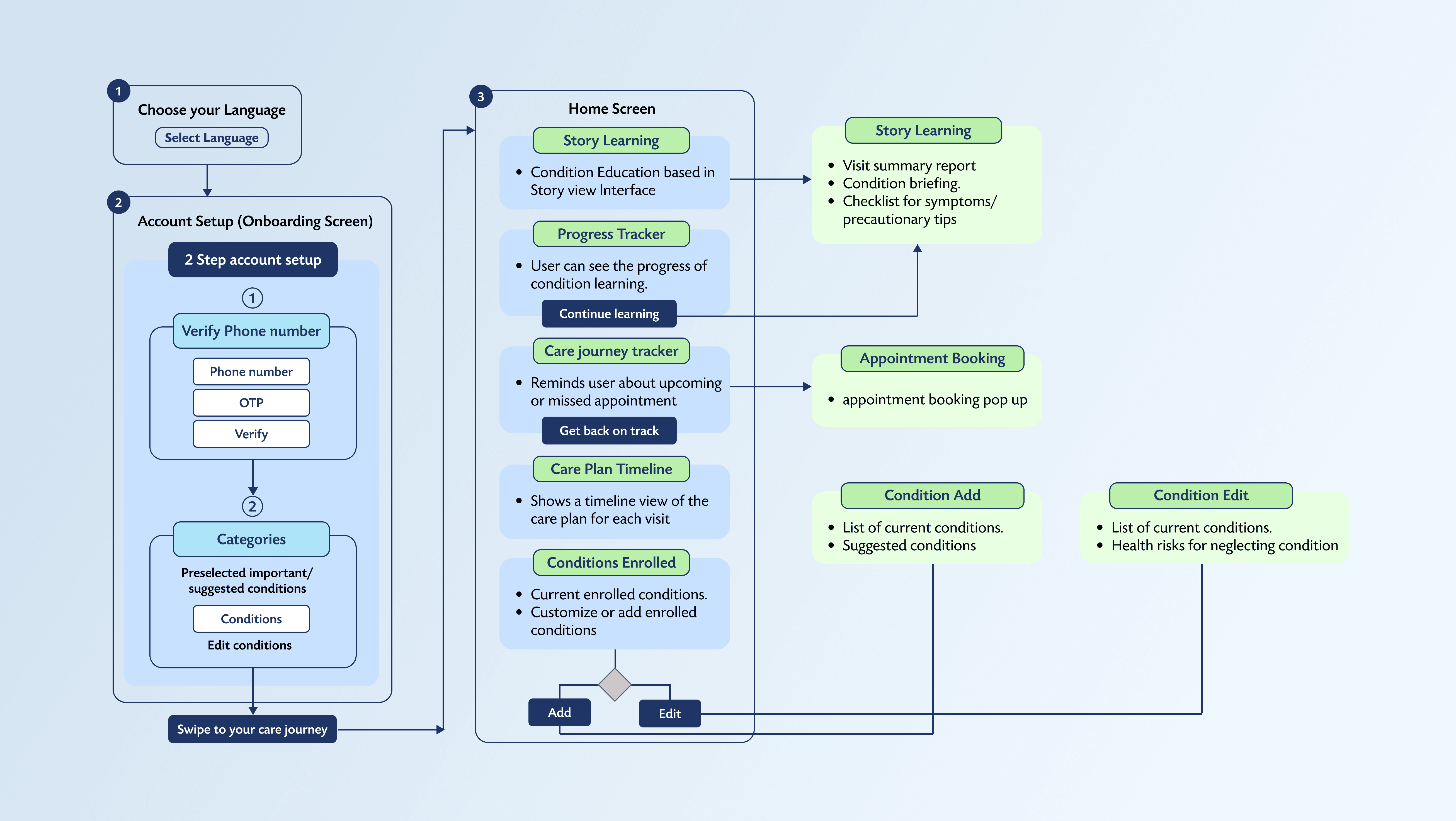
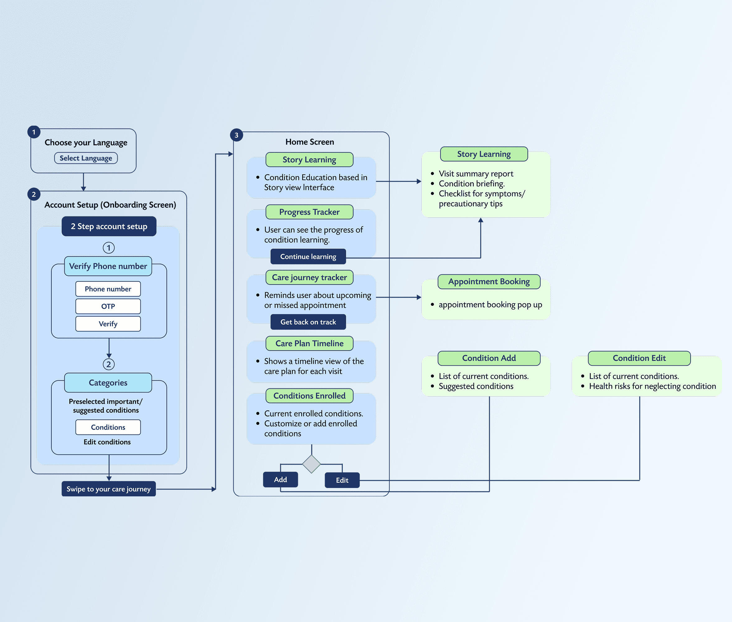
Key Features


My Design Process
Research & Insights
I collaborated with stakeholders to identify patient pain points. Since direct patient interviews weren't feasible, I analyzed existing clinic feedback and conducted secondary research on AI-powered healthcare. This revealed that:
Patients struggled with care plan comprehension.
Non-English speakers faced accessibility issues.
AI integration could enhance care gap identification.
Ideation & User Flow
To visualize the solution, I mapped out a user flow chart, ensuring a seamless journey from onboarding to care plan management.
Brainstormed and iterated ideas with my Senior UX/UI Designer.
Defined touchpoints for interactive learning, symptom tracking, and care plan visibility.
Prioritized ease of navigation and accessibility.
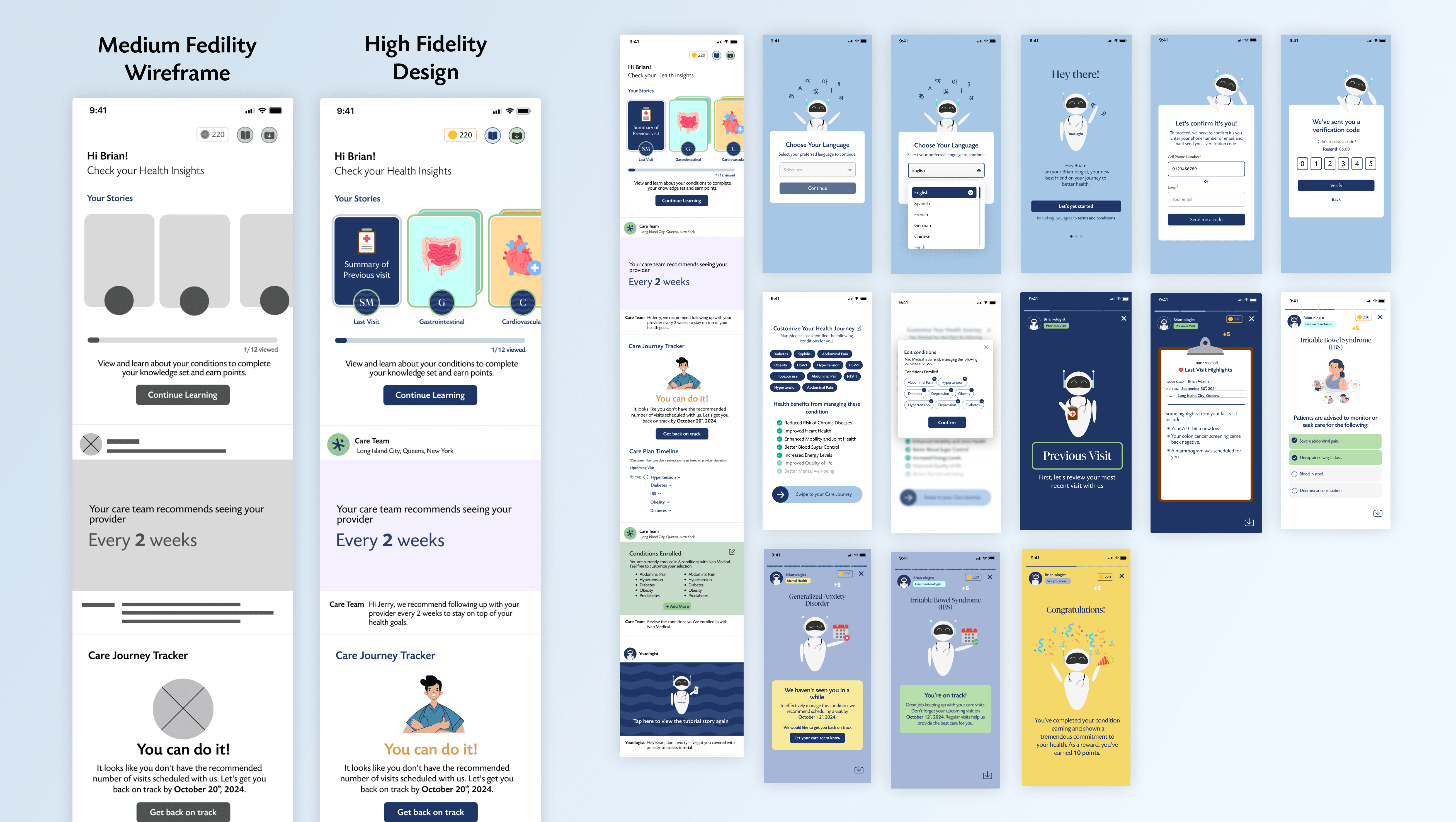
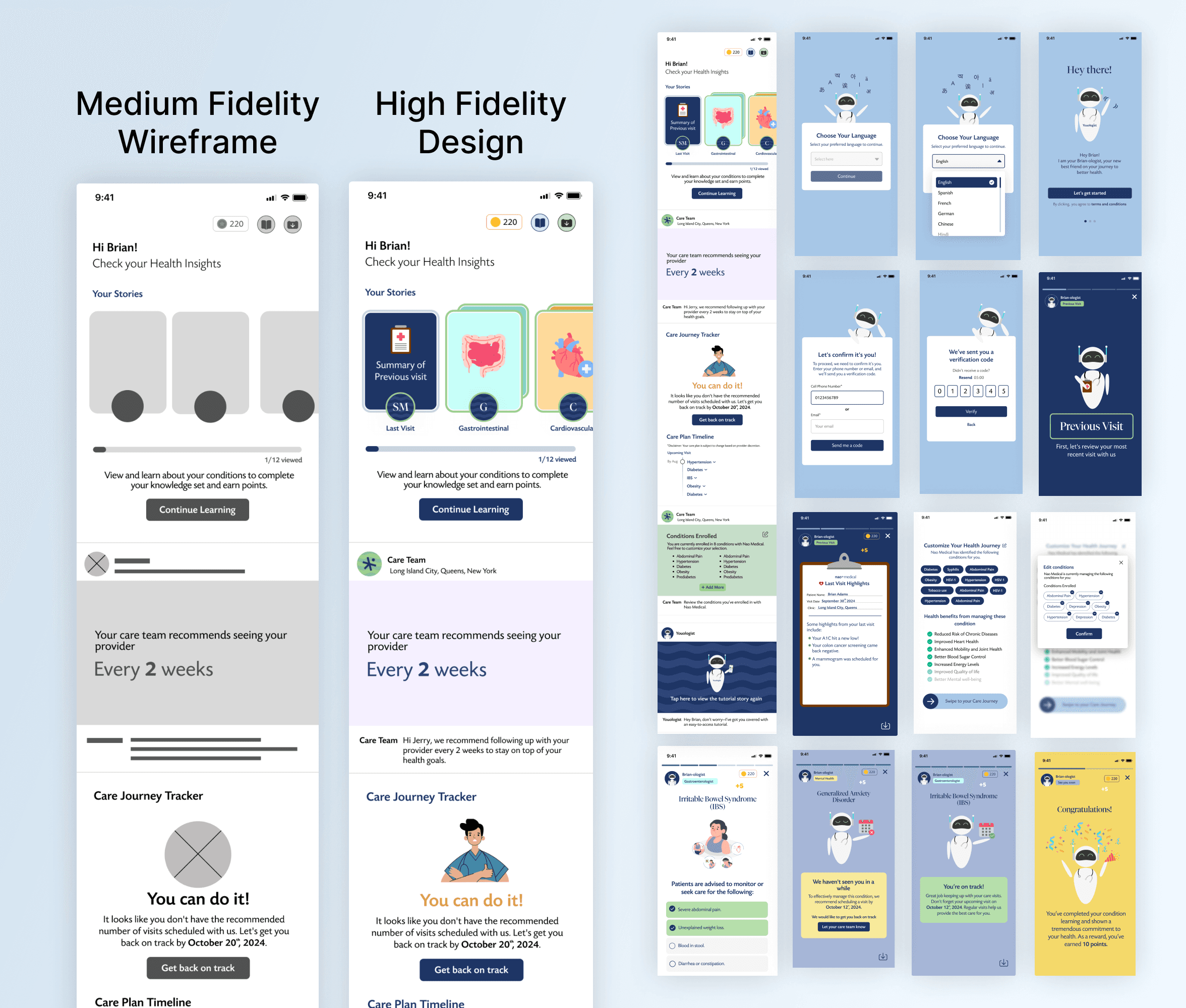
Wireframing & Prototyping
I created low and mid-fidelity wireframes to define the app structure. Through multiple feedback sessions with my Senior UX/UI Designer, I refined the UI while maintaining the core user flow.
Introduced familiar, social media-inspired design patterns to enhance user engagement.
Developed interactive prototypes for realistic user testing.
Usability Testing & Iterations
After the app went live, patient feedback revealed the need for:
Language Selector: Added to the onboarding screen, improving accessibility for non-English-speaking patients.
Educational Levels: To personalize learning, I implemented content tiers based on users' medical literacy levels.